


A sixth battalion was added in January 1757 and throughout the Seven Years War "the arm was repeatedly reorganised" (Kronoskaf - see previous link). Naturally every army the French deployed throughout the war used guns and gunners, and often pioneers and miners too.
During the SYW each battalion had one colonel's colour and one Ordonnance colour. The Ordonnance colours were unusual, as the material of which the coloured quarters were made was made of "tafettas changeant", a weaving technique in which warp and weft threads are of different coloured silks - as Pierre Charrié, the expert on French flags, says, these colours are difficult to represent as an illustration. The 1753 entry in État Général des Troupes Françoises is very unclear: "cinq Drapeaux d'ordonnance aurores & verts taffetas, changeant & aurores & rouges de même par opposition dans les quarrés". This seems almost to be the standard definition of the flags for the period - but I found in a 1721 volume on Google a very clear description which as far as I can tell is also accurate for the SYW. The book is Histoire de la Milice Françoise Volume 2, 1721, by R.P.G. Daniel and the flag description is on page 540. It says: "Le drapeau au premier & quatriéme canton est aurore & vert changeant, au second & troisiéme aurore & rouge changeant, la croix blanche au milieu semée de fleurs de lys d'or". Mouillard renders them as a rather stripey mix for the aurore-rouge cantons and the aurore-vert cantons somewhat blotchy, with the green emphasised. The 1757 MS shows much more strongly defined blotches of the 2 colours in each canton. Here below is my first attempt to render this flag (I'm still trying alternative methods):
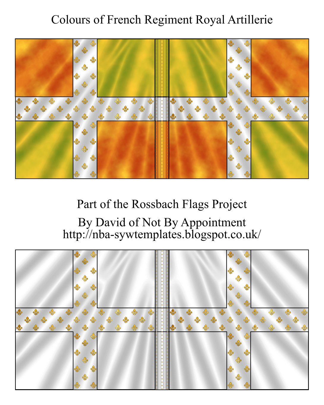
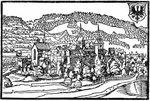
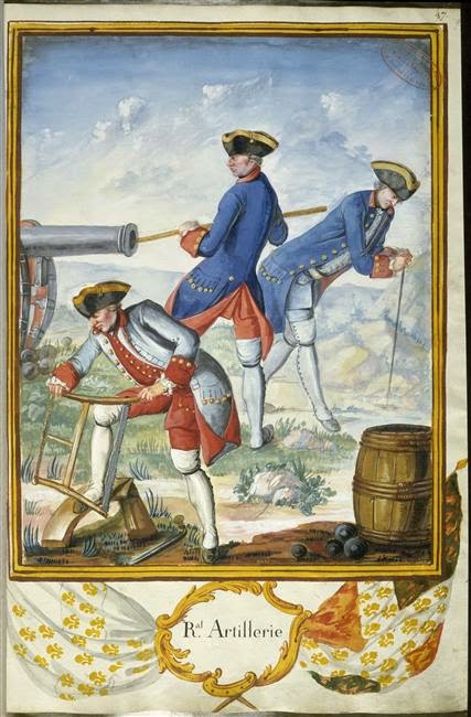
And here is the 1757 MS depiction of both flags and uniforms:
I'd like to thank Jean-Louis Vial, Christian Rogge and Stefan Schulz for helpful discussion on and useful suggestions about how to depict the Ordonnance flag of this regiment.

Another splendid flag, David. Many thanks.
ReplyDeleteAs an idle reflection on a friday night (the boy went down easily for a change!) , I thought I'd note how struck I am by the contrast in design and aesthetic of this flag and the hard traditional heraldry of some other contemporary nations. Those of Saxony and Hesse-Darmstadt come to mind but there are many others. The prominent cross and quartered field of the french flags might look very traditional to our eyes now and we think of Ancien Régime upon seeing that flag, Nevertheless, the use of such a textile as the taffeta changeant which has at least two shades (and those never the same as it changes as light hits its uneven surface, and possibly stripes woven in on top of that!) makes me wonder how it unusual must have looked at the time. Surely it was chic, refined and very very modern. It makes me wonder if, while others are staking the same old dynastic claims with their flags, the french were claiming an abstracted national identity and a concept of modernity itself (L'âge de lumières) with theirs.
I'll end my ramble here before I embarrass myself further. I wonder what was in my coffee...?
Oh - and I love the new header image on your page, the garrison soldier on the rampart. Makes me want to build a terrain piece!
ReplyDeleteHi Jim,
ReplyDeleteThanks. :-)
Interesting thoughts, coffee fueled or not! ;-) I certainly think the Bourbons were appealing to a sense of unchanging tradition - no need for fancy complex heraldry when you have something so simple and right instead. But as you say, the material employed does suggest a desire to use something that then must have been pretty modern too - the best of the old and the new together, perhaps. As far as I can tell that type of mixed silk seems in fact to have been more common up to the WAS - several French regiments disbanded after that war also had taffetas changeant flags, apparently. (I need to chase this up to confirm.) Why the artillery alone kept that style, I don't know, as in many ways they were the most modern of French units, not hobbled by the desire to please the aristocracy by restricting access to commissions to the nobility only and also keen to train new recruits in the scientific skills needed for a modern artillery.
All very intriguing...
Thanks for a very interesting comment.
Cheers,
David.
P.S. Glad you like the new header too - it's by a very quirky German artist called Carl Spitzweg: https://commons.wikimedia.org/wiki/Category:Carl_Spitzweg He did a number of military subjects, of which this is one, showing a bored 18th century sentry yawning on a clearly neglected and peaceful rampart (the fabric is crumbling, topped by vegetation, there is a line of washing, and the cannon muzzle has straw (a birds' nest?) hanging out of it, with a bird perched on top). It's the very picture of a nation at peace, probably for decades. It's delightful. :-) And yes, it would make a splendid little diorama!
ReplyDeleteCheers,
David.
Hi David,
ReplyDeleteI thought about all this a moment or two yesterday and then googled about a bit. I'm now of the impression that the taffeta changeant (I learn that this is in fact "shot silk") was not quite so rarified as I had thought Friday night, though it is very very fancy. Scarlett Pimpernell-scale fancy! So your excellent answer seems quite convincing to me. Nevertheless, it does still seem like modern design to me. A simple layout and clean ideas as you say, and very sumptuous, multivalent materials. To quote MC Hammer "you can't touch this" was surely part of the message! (Apologies, David Bowie might better suit the taffeta...)
I'm an archaeologist and part of the training of an archaeologist is iconography, the tenant of which is that nothing in a gesture of communication is without meaning. I have difficulty thinking of a more deliberate and self-conscious gesture of communication than the construction and presentation of a flag. I'm way out of my depth here and my coffee cup is running low but the shimmery material says "light" and so reinforces the non-feudal Sun device often displayed on flags of Royal regiments. All the while using the cross and quartered field that unifies the flags of the entire army, the State and the heraldry of many of the nobles as well (our Laval-Montmorency family for example). I'd say these French were clever fellows. Miles ahead of the competition, how did they ever come out on behind in the SYW?
I'm eager to see what your next treasure will be. No pressure! ; )
Jim
Love the flags!!Great colours!
ReplyDeleteHi Jim,
ReplyDeleteThanks for the interesting comment (again!). Sorry it was slow appearing; I wasn't online for quite some time so could not approve it. As you say, the flags do represent very good PR; sad that the French army was at such a low ebb in the SYW. They still managed to invent light infantry, though ;-) (although the British were having to learn/invent the same through practical experience in North America).
It's very late so I'll leave it at that for the moment but I think the subject of French army heraldry deserves much more thought!
Next will be a Swiss regiment's flags for Rossbach, probably Diesbach, but it's not certain yet...
Thanks again.
Cheers,
David.
Thanks, Ray! Again, sorry your comment was slow appearing. I'm still not absolutely happy with the Ordonnance flag but it will do for the moment! ;-)
ReplyDeleteCheers,
David.
Once again I come late to a blog, so I hope I will be forgiven.
ReplyDeleteI gave up blogging some while ago and deleted all my old blogs ("At The Olde Dessauer's Table etc.) however I'm back and have decided to set up a completely new one (well, two actually) using my pseudonym of Bob Black. It can be reached at: http://uptotheirknees.blogspot.co.uk/
I hope you'll take time to visit now and again David? 'Cos I always appreciate your hard work. (And by the way, I still use your super templates in my regimental databases).
Cheers for now
Steve Turner
Hi Steve,
ReplyDeleteWelcome back! Sorry to be slow approving this comment and replying - haven't been online for a while.
I'm glad to hear you still use my templates; I hope to add a few more soon.
Right, I'll now pop over to your blogs and post a comment there too. :-)
Cheers,
David.
P.S. Steve, I went to your blog and left a comment (I think; it wasn't clear that it went through this time. I hope it's not Blogger trouble...)
ReplyDeleteWill wait to see if it turns up on your blog before trying again.
Cheers,
David.
Sorry about your missing comment David, but one has now been posted. Don't know why that should happen, but I suspect it has something to do with having third party cookies enabled (something I don't like doing).
ReplyDeleteHope you'll visit again soon.
Steve.
PS I also have another blog at:
http://astoryoffantasy.blogspot.co.uk/?zx=e52c22533a5299d0
for anyone who might be interested in Heroic Fantasy stories.
Hi Steve,
ReplyDeleteThanks. Have now posted again on your Blog and hope that one appears too in due course.
I'll pop along to your Heroic Fantasy blog soon too.
Cheers,
David.